Syfe Case Study
After completing the UX writer challenge issued by Syfe, I’ve decided to challenge myself to look at it through the eyes of a UX designer.
The Challenge
Syfe saw a decrease in people completing the entire onboarding process. To address this, I’ll:
Analyse the user experience during the Syfe Wealth’s onboarding process
Propose solutions to increase the number of completed account creation
Thought Process
Syfe’s mission is to
“Transform the way people manage their money and make high quality financial services affordable and accessible to all.”
Therefore, for this challenge, I’ll be focusing on the “accessible to all” value in Syfe’s mission and inject that into the onboarding process.
Research Phase
Before diving in, I wanted a deeper understanding of the issues faced by the users. To do this, I did a heuristic analysis, competitor research and several user interviews:
1. Heuristic Analysis
As we can see, a few key problems that could lead to the customer churn include:
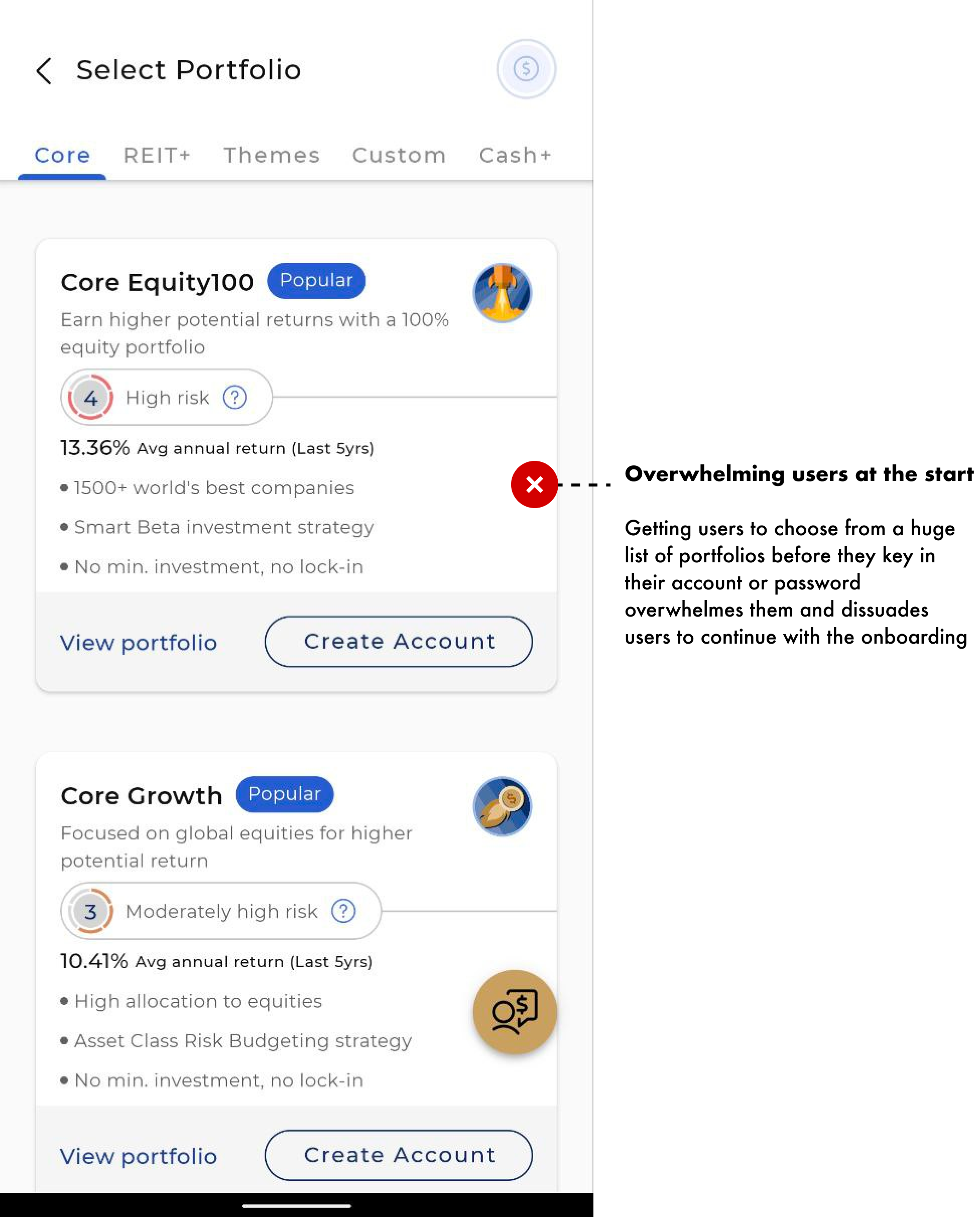
Overwhelming for the newer users
Intrusive design on certain fields
Visibility of system status not prominent enough from the current stepper
Lack of consistency in tooltips
2. Competitor Analysis
The table above shows the pros and cons of the other Robo-Advisors’ onboarding process.
3. User Interview
To find out how real users felt about the onboarding process, I conducted several user interviews with the following questions:
Have often do they use robo-advisors?
What was the easiest thing to do when signing up?
What was the hardest thing to do when signing up?
How did you feel as you’re signing up?
What are some of the things you felt could be improved?
After the interview, I charted out the answers into an affinity map to identify what were the key issues to address.
From this, I identified three things to help improve the onboarding process.
Sign up forms
“Select a portfolio” section
Progress tracker
Empathy Building
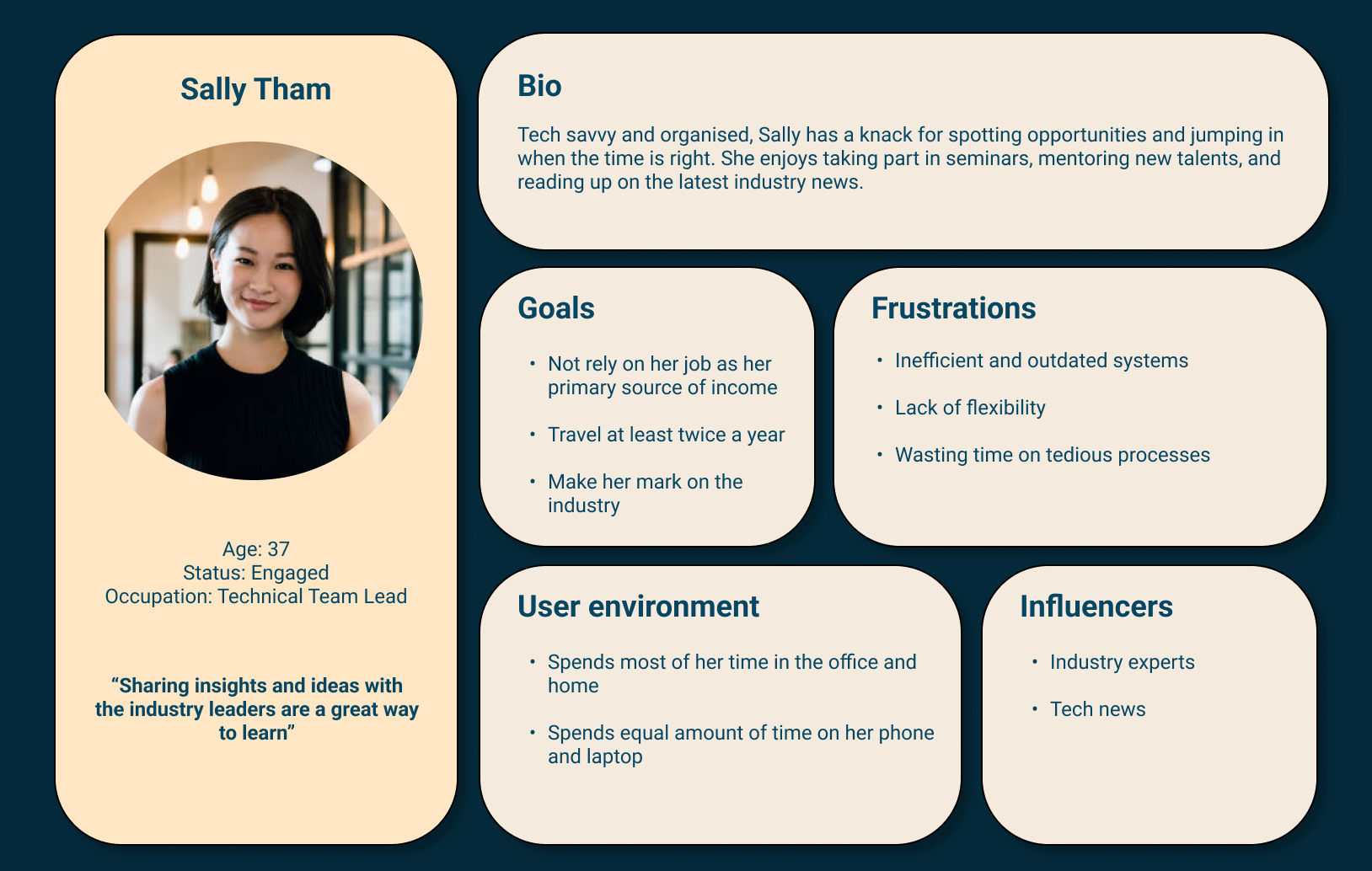
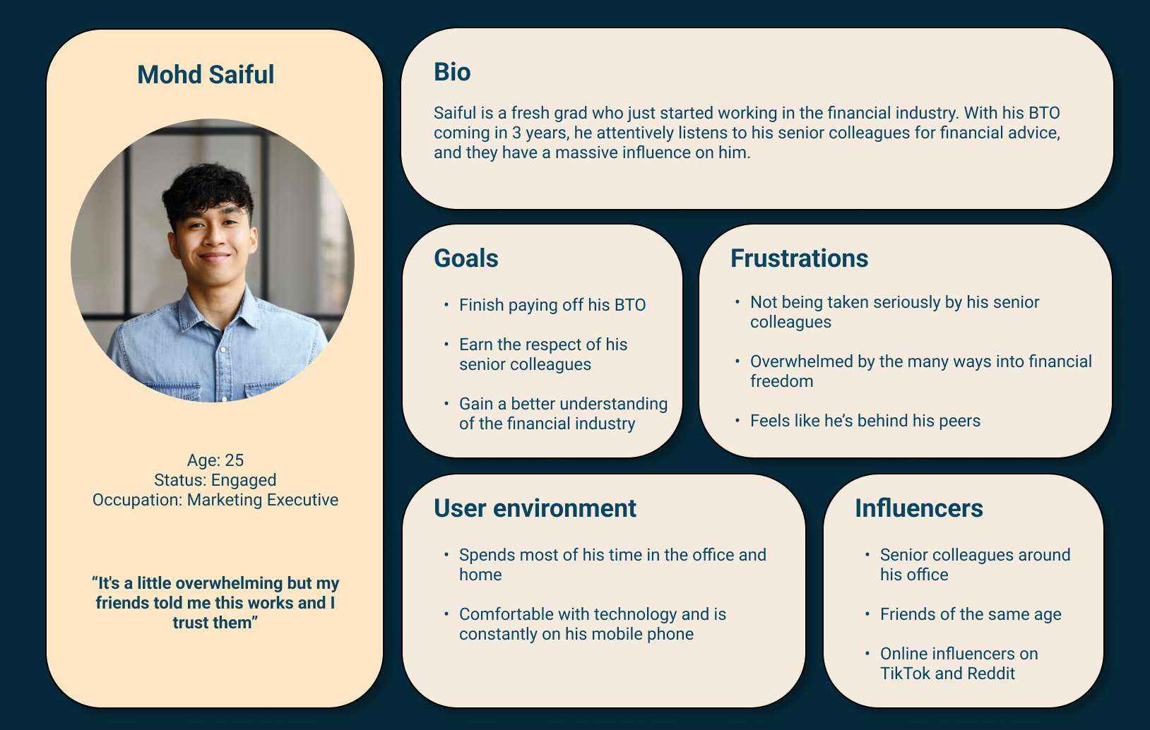
I then built 3 audience personas from the results to help us better understand the situation.
User Journey
And when we look at their individual journeys:
User Flow
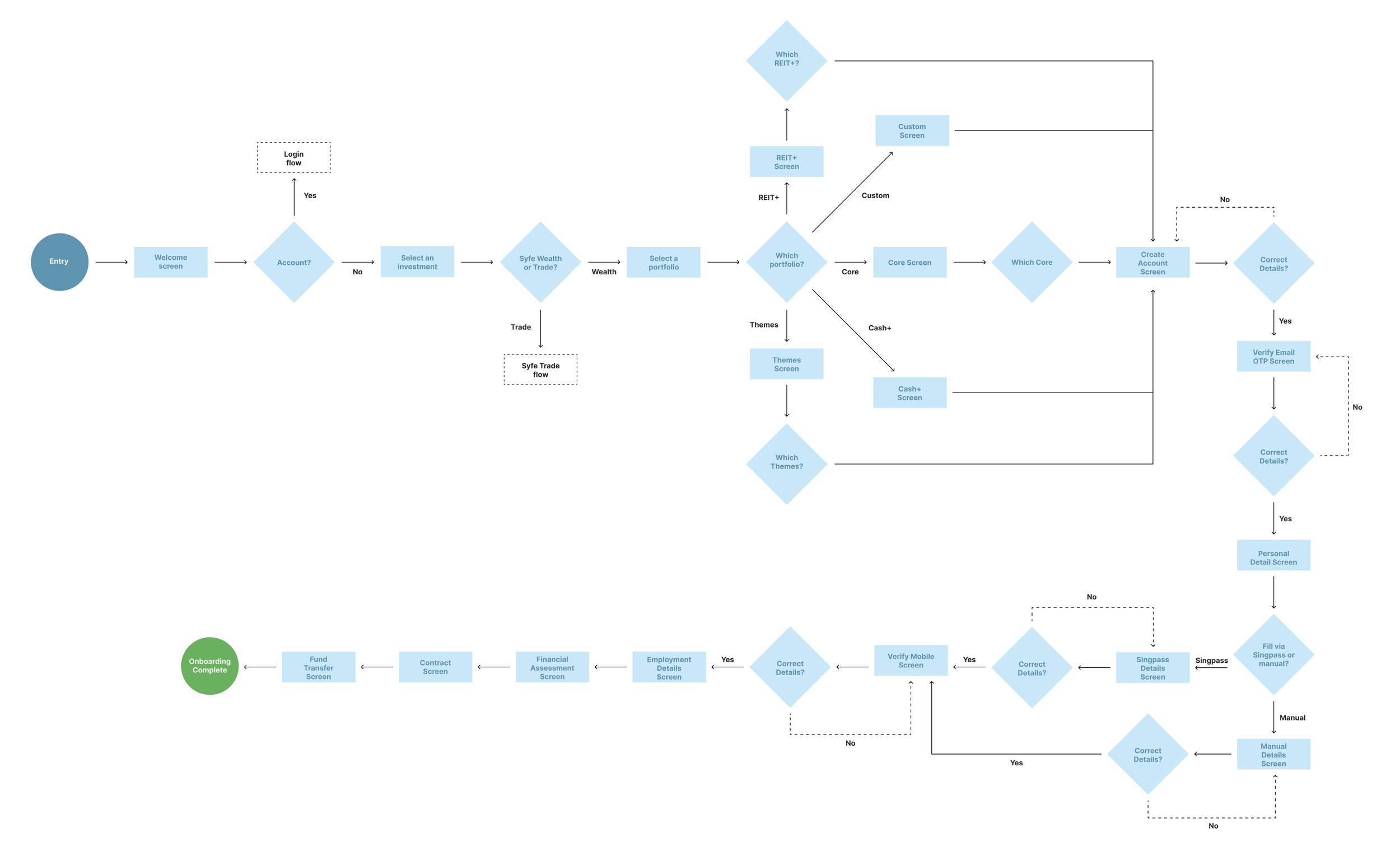
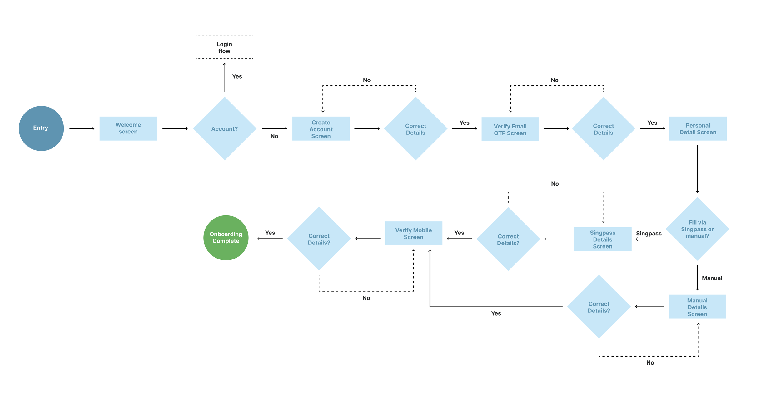
To help get a clearer picture, I charted out the user-flow for the current onboarding process:
From this, we can see the current flow front-loads the cognitive load on the user with the “Select a portfolio” like most of the interviewees pointed out.
Design Phase
As Hick’s Law states that we should aim to make the choice easier for the users, I’ve opted to trim the onboarding so users would reach the dashboard quicker.
Removing the “Select a portfolio” phase from the “Create an account” phase, it:
Allows us to match the onboarding system to one that users are familiar with
Shifts the task with the highest cognitive load to the back
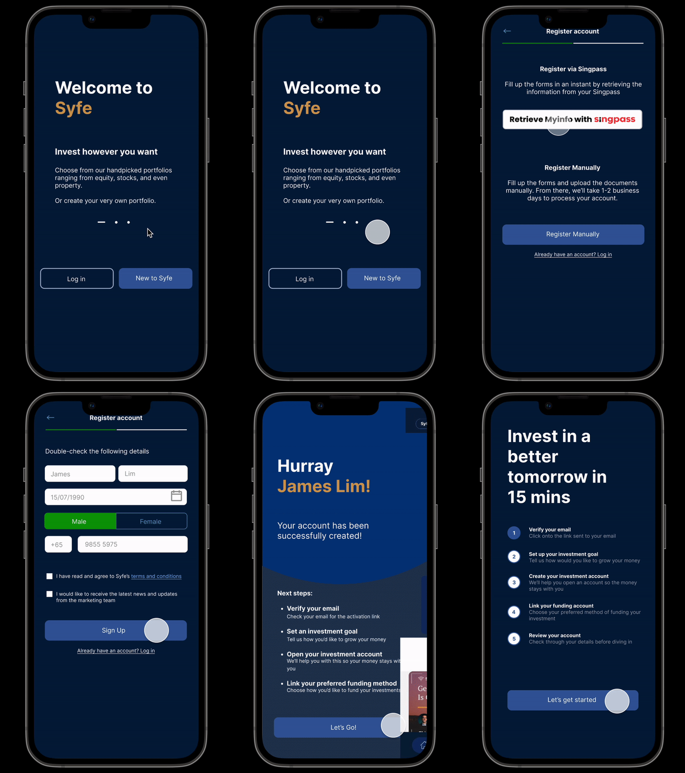
In order to see how the new onboarding plays out, I’ve mocked up the following screens:
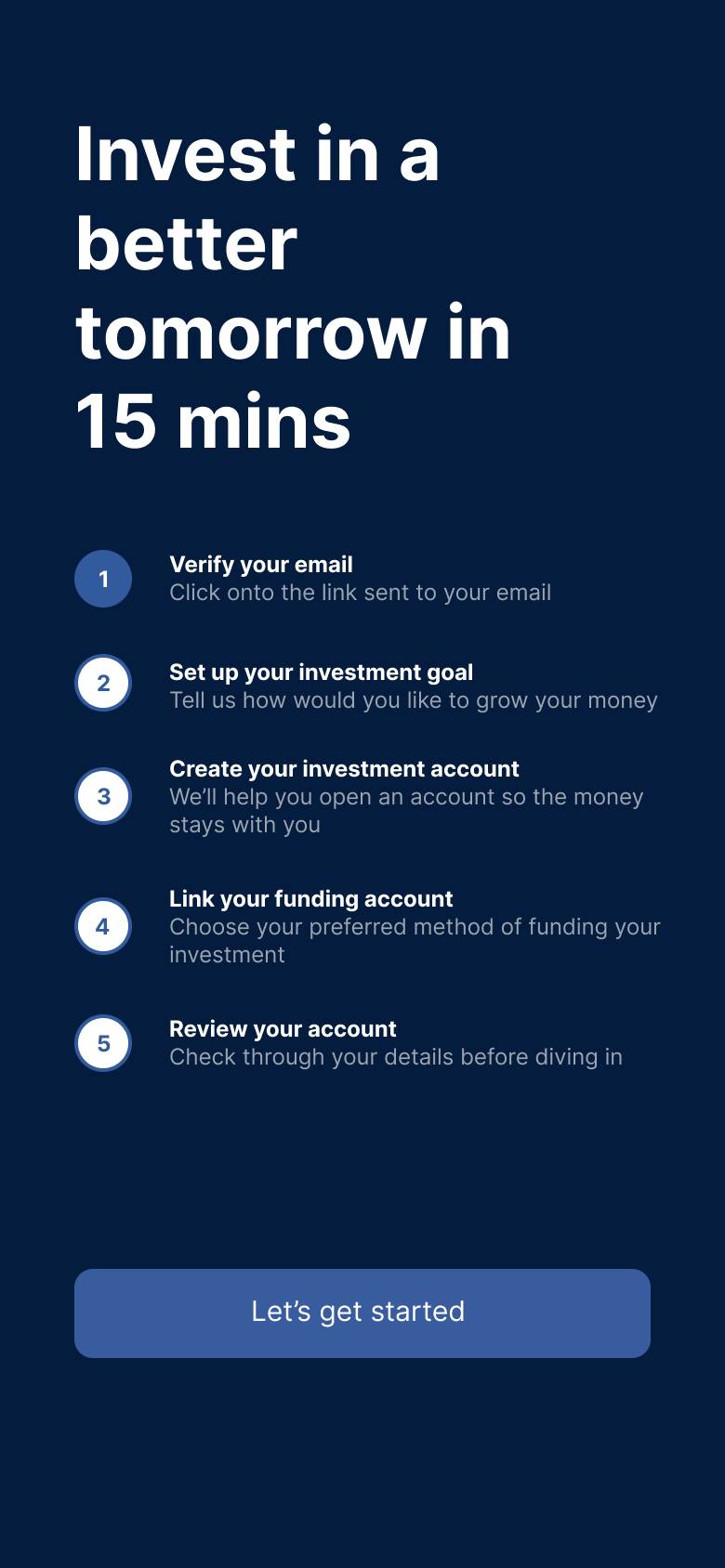
Welcome screen
Create account
Register account
Activate account
Onboarding complete
Dashboard
Expectation management
Designs
While creating the designs, I’ve opted to retain as much of Syfe’s corporate identity for the UI. You can view the clickable prototype here or from the gif here:
The individual screens for the new onboarding process are as follows:
Welcome screen
These screens remind users of Syfe's unique selling points and encourage users to log in or sign up.
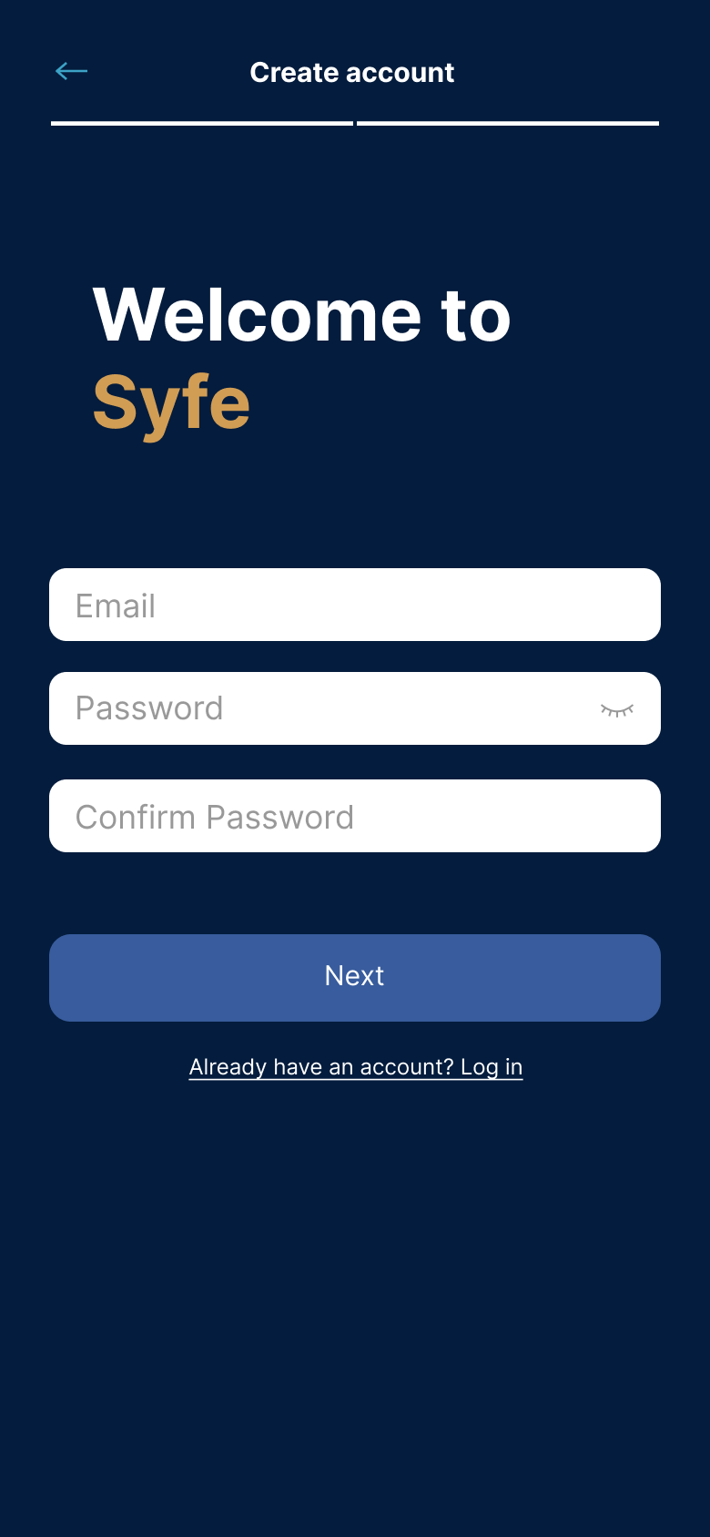
Create account
Users would fill in a simple form to create their account.
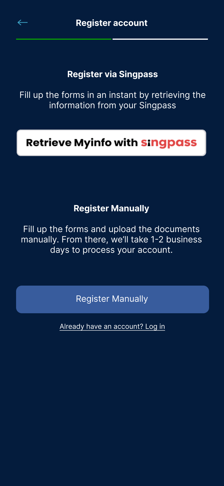
Register account
From there, they can choose to manually fill in their details or do so via Singpass.
Activate account
Once that’s done, users will then receive an SMS OTP where they can key in here to activate their account.
Onboarding complete
This screen will let users know that they've completed the onboarding process and inform them of the next steps.
Dashboard
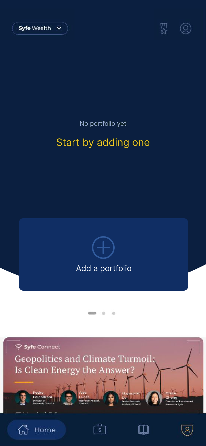
Upon completing their onboarding, users will arrive on the dashboard where they can explore the app and create their very first portfolio.
Expectation management
This screen’s purpose is to provide users a rough timeline to help manage their expectations as they build their portfolio.
Key Takeaways
Some takeaways from this UX challenge include:
Being open to exploring alternative solutions. In my initial rounds, I became too hung up on trying to trim the portfolio selection process. Looking back at the user interviews made me realise I could move it to streamline the process.
The importance of product managers. During my challenge, I kept questioning the current system and its purpose. Collaborating with a dedicated product manager would allow me to tap into their knowledge and explore other methods of presenting the information.
What I would like to explore next for this challenge:
Revisit the portfolio selection process and streamline it
