Daily UX Writing Challenge
Here’s my take on the Daily UX Writing Challenge.
Day 1
Cancellation Notice
Scenario:
A traveler is in an airport waiting for the last leg of a flight home when their flight gets abruptly canceled due to bad weather.
Challenge:
Write a message from the airline app notifying them of the cancellation and what they need to do next.
Headline: 45 characters
Body: 175 characters max
Button(s): 25 characters max
Rationale:
I used a clear and concise headline to ensure that users could catch the main point at a glance.
The body copy starts with an apology and the user's name, which allows us to humanise the app and reassure users that we're here for them—Not some computer program. “Unsafe weather conditions” also helps impart the feeling that the cancellation was due to us prioritising the user’s safety.
Finally, I proposed a solution to minimise the feeling of helplessness in the situation. But instead of deciding for them, the app gives users a sense of control by letting them choose if they’d like to find another flight or book the next available one—Helping them find their internal locus of control and thus reducing their stress.
Day 2
App Promo Page
Scenario:
A user is a working parent, and a big sports fan, in the midst of their favourite sports season who can no longer attend games.
Challenge:
Write a promotional screen for an app that lets a user choose teams, sends game reminders, real-time score updates and highlight videos.
Headline: 40 characters max
Body: 175 characters max
Button(s): 25 characters max
Rationale:
A good headline summarises the value proposition while maintaining clarity. “Stay close to the action” lets the users know that this app ensures they’re never far from their favourite sports.
The body copy then lists how the app helps users in bullet points to prevent overwhelming the users while still putting our best foot forward.
I’ve also chosen to call it a companion instead of an app to impart that sense of camaraderie that sports fans embody, helping us better relate to the users.
Day 3
Error Message
Scenario:
The user entered the wrong email address to sign in to their account.
Challenge:
Tell the user to enter the right email.
40 characters max
Rationale:
When multiple fields are present, the error message must be specific. Hence, I placed it just below the email field, where the error happened, instead of having it as a pop-up.
Another thing to note is to Never blame the user. Accusatory language is a big no-no. Instead, I removed the fault on the user's end and provided a fix for them.
Day 4
Promotion Message
Scenario:
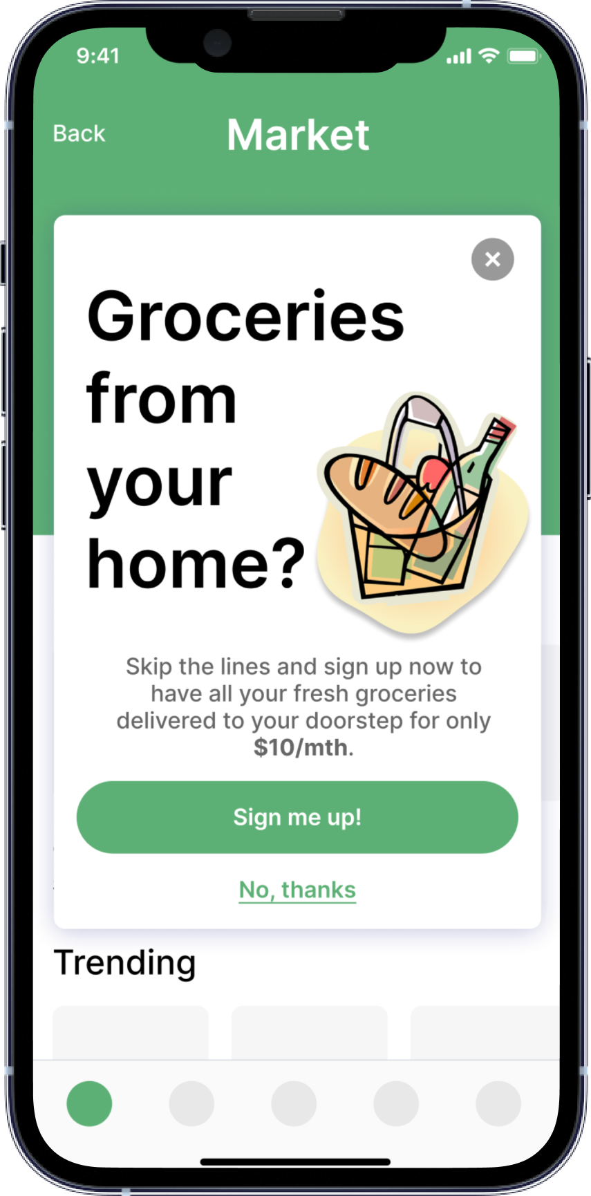
A user is in their favourite supermarket. They open the supermarket’s app on their phone to see what’s on sale and are greeted by a promotion.
Challenge:
Write a promotional home screen for a subscription service that delivers groceries to the user once-a-month for a flat fee.
Headline: 45 characters max
Body: 175 characters max
Button(s): 25 characters max
Rationale:
Pop-ups are annoying and users usually gloss over them. So, when writing one, I made it as eye-catching as possible to capture their attention. The headline helps pique the user's curiosity, leading them to read the body copy.
“Sign up now” in the body copy used to help convey urgency to encourage the users to accept the promotion.
While crafting promotional CTAs, I’ve opted for something that links to the question in the headline while staying away from confirm shaming.
Day 5
App Crash Message
Scenario:
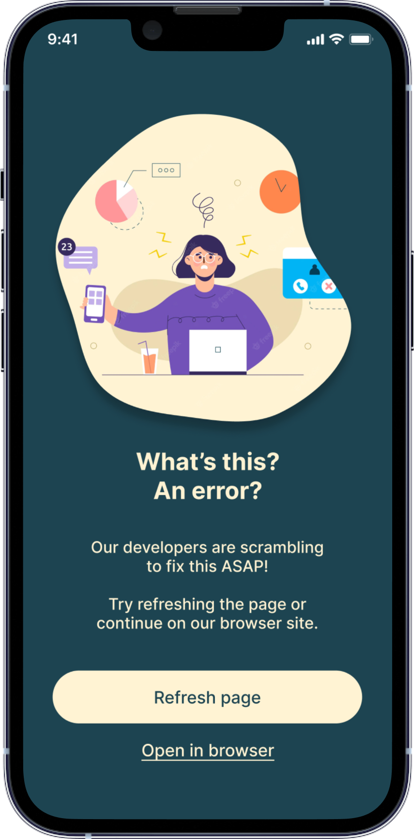
The user works in graphic design. While critiquing a design in a mobile app, their phone abruptly turns off. When they restart the phone, they reopen the app.
Challenge:
Write a message that the user will read immediately upon opening the app. What do they need to know? What steps (if any) do they need to take to recover their content? What if they can't recover the content?
Headline: 40 characters max
Body: 140 characters max
Button(s): 20 characters max
Rationale:
During unexpected app crashes, the first thing our flustered users will want to know is if their work is lost. Hence, I crafted the headline in a way where the first thing the users see is a comforting reassurance that everything is fine.
I opted to use “saved” instead of “safe” to help show that the app took on a more active role and rescued the users’ work.
The body copy contains a simple explanation of what happened and helps bolster the user's confidence in our app by letting them know their files are safe with us.
Day 6
Fire Warning
Scenario:
It’s Monday. A user has just gotten into their car to drive to work. They plug their phone into the car and start driving.
Challenge:
How would you let the user know there’s a fire happening in a nearby town that is causing road closures? The effect on their commute is unknown, but there is a definite danger if the fire gets closer. How do you communicate this to them? When? Write it.
Headline: 30 characters max
Body: 45 characters max
Rationale:
After reading the scenario, I wanted my message to be as direct and as lean as possible so users won’t be overwhelmed.
I employed conversation mining to identify how users are used to receiving their traffic updates and crafted the headline to be straight to the point.
And instead of telling users the potential dangers, I opted to go straight to what they were concerned about: the quickest alternative to get to work.
Day 7
Sports Notification
Scenario:
A sports fan is at a wedding while their favourite team is playing against their arch-rivals. Their team scores.
Challenge:
How would you, quickly, let the sports fan know about the latest play, the current score, and the key players? Write it.
Headline: 30 characters max
Body: 45 characters max
Rationale:
As a person who doesn't watch any sports, this challenge calls for more research on my part.
Trawling Reddit and sports forums, I found that fans already had a wishlist of what they wanted in a mobile sports app—to know which player scored and the timing of the scores.
And after studying a couple of competitor apps, I came up with a notification that's straight to the point and written in a format that sports fans were already familiar too.
Day 8
Live Concert Pop-up
Scenario:
The user is a casual music fan and (on occasion) goes to live concerts. They have a music player app on their phone.
Challenge:
Tell the user that one of their favourite bands is playing live in their town. How would you compel them to want to go?
Headline: 30 characters max
Body: 45 characters max
Button: 25 characters max
Rationale:
As users usually gloss over pop-ups, I chose to be as direct as possible while crafting this live concert pop-up.
Hence, instead of giving in to the copywriter in me and fluffing the event up, I went for clarity and provided the audience with everything they needed to know at a glance.
The headline tells the 'who' and 'what' while the body copy covers the finer details like 'where' and 'when'.
Day 9
Credit Card Expired Message
Scenario:
The user is trying to rent a car using an application but the credit card on file has expired.
Challenge:
Write them an error message so that they can correct the problem.
Headline: 30 characters max
Body: 45 characters max
Rationale:
When users are in this situation, they’ll be frustrated and want a solution as soon as possible.
While crafting this error message, I ensured the headline quickly and clearly explained why the payment did not go through. The body copy then offers a simple solution along with an alternative workaround.
Day 10
Sensitive Data Entry Request
Scenario:
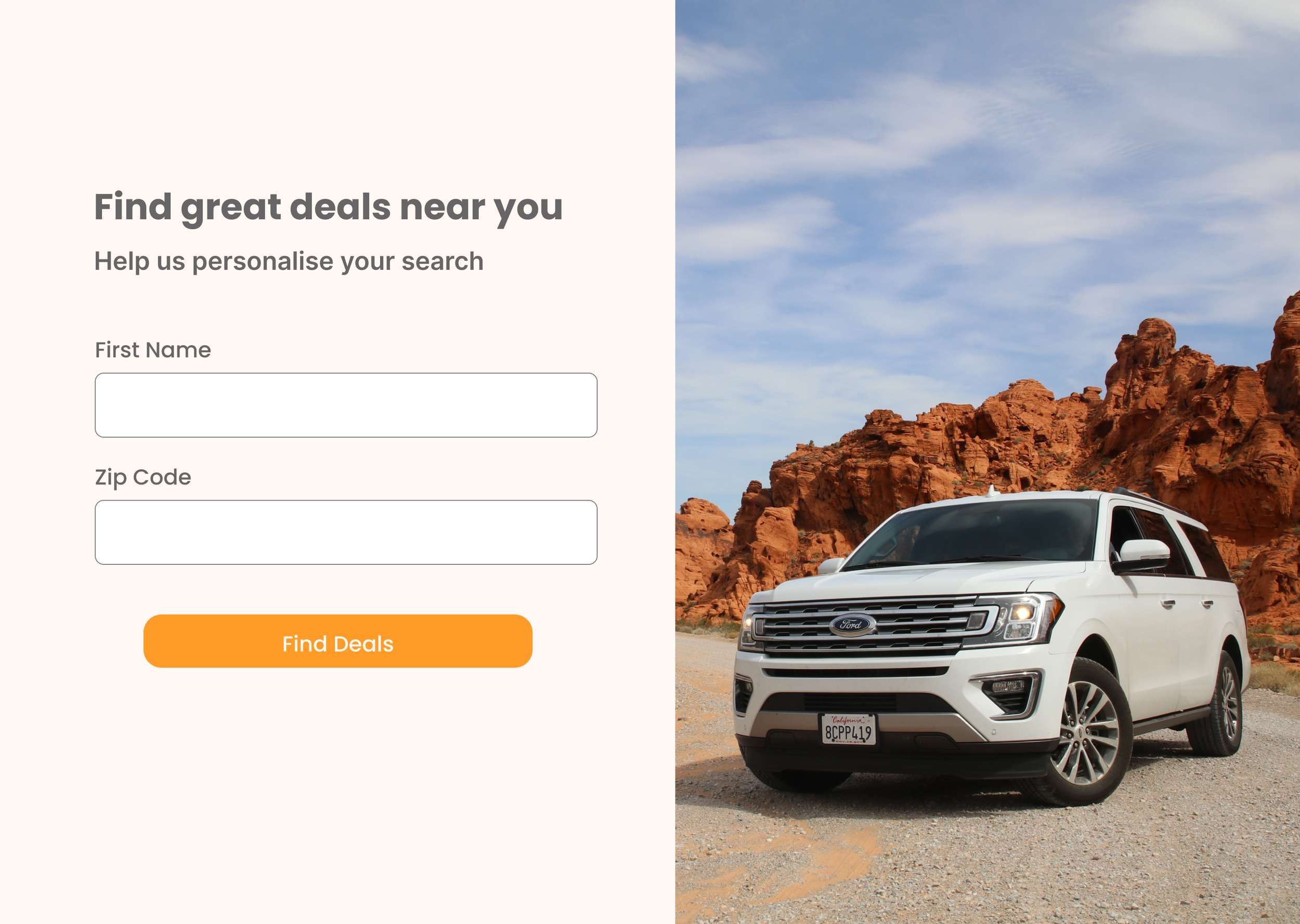
The user is trying to view a website to help them buy a car. But, the content can’t load without the user’s location. They need to enter their ZIP code and first name.
Challenge:
Ask them where they live and who they are without sounding like you're unnecessarily mining their data.
Headline: 25 characters max
Body: 45 characters max
Button(s): 15 characters max
Rationale:
Requesting sensitive information from users may make or break the experience. Hence, I positioned the value proposition upfront before the ask.
The headline goes straight to the point as to why users are on our site (to find great deals), and the body copy eases them into providing the information by telling them what they would get out of it as well (a more personalised search).
This allows us to be transparent with the data usage, ensuring users, and elevates the brand impression as someone who’s here to help.
Day 11
Meta Description
Scenario:
An elderly user is doing a Google search to find an easy way to buy contact lenses online.
Challenge:
Write a title and meta description for a website that sells subscription contact lenses delivered to a user every 30 days—convince them to try it.
Title Tag: 60 characters max
Meta Description: 160 characters max
Rationale:
While writing this, I wanted to highlight the convenience we provide as the challenge stated that the user is looking for an easy way to buy.
I avoided the word “subscription” as elderly customers may not be familiar with the model. Instead, the title includes similar terms to what the user searched to address their concerns directly—following good SEO practices.
The body then provides more information and showcases how quick and easy the process is by stating that they can “order contact lenses online in just 5 minutes”.
Day 12
Unique Name Error Message
Scenario:
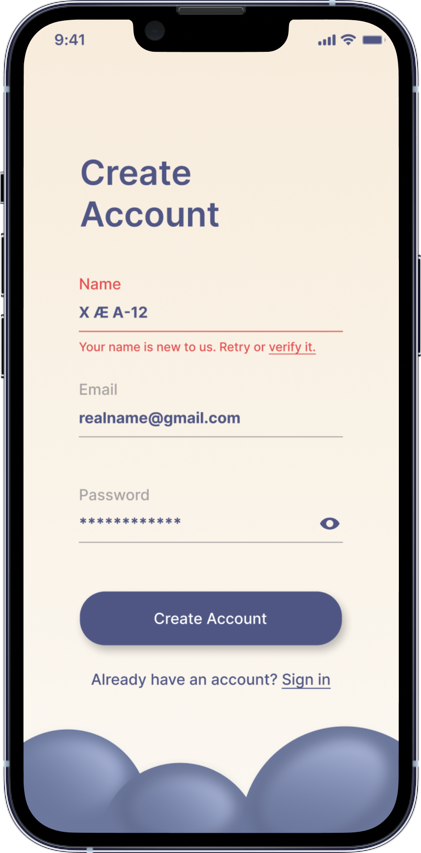
A user is creating an account. When they come to the step where they are asked to enter their name, they get an error message. A fraud detection software thinks their name is fake—but it’s wrong 5% of the time.
Challenge:
Write an error message that prompts them to fix the error without shaming them for having a fake-sounding name.
45 characters max
Rationale:
Creating a single error message for two groups of users while staying within the character limit was tough.
To tackle this, I crafted the first half of the message to address both the users who potentially keyed in the wrong name and those with unique sounding names without shaming them.
Subsequently, I provided two separate solutions to the users, each targeted at the different groups of users.
Day 13
Route App Push Notification
Scenario:
A short-haul truck driver has a phone app that monitors his route, schedule, fuel & deliveries. He has 6 more deliveries before stopping for fuel and lunch. Due to unexpected traffic, he’s behind schedule.
He can choose to stay on his planned route for a few more stops, but risk running low on fuel and missing lunch, or he can get fuel and lunch now and finish the deliveries later.
Challenge:
Write a push notification alerting him of this dilemma and options.
Headline: 30 characters max
Body: 45 characters max
Button(s): 25 characters max
Rationale:
As the user is on the road, the headline needs to communicate the situation as soon as possible. Hence, I’ve placed the low fuel message and delivery status there. This way, the user can understand the situation at a glance and easily make the decision.
The body then provides the options for the user to choose between continuing the journey or stopping for a break. “We” is also used to reinforce the app as a supportive partner to the user’s journey.
Day 14
Ambiguous Error Message
Scenario:
A user is shopping using a price comparison app that boasts “real-time” pricing on items. As they are checking the price of an item, something goes wrong. The problem is unknown.
Challenge:
Write a message that informs the user that they cannot access the app right now. You cannot specify "why" the app doesn't work, you also want them to continue using the app.
Headline: 30 characters max
Body: 120 characters max
Button(s): 15 characters max
Rationale:
I opted for a light-hearted tonality for this challenge to help reassure the users. Before doing that, I ensured that despite us being unable to specify what went wrong, the users were not in a high-stress situation when receiving this message. Otherwise, the tone may come off as us making light of their current state.
And considering this isn’t a critical phase of their customer journey, users would not be in a stressed-out mental state—allowing us to approach the topic with a touch of cheekiness.


